Inside the Viblock Rebrand: 5 Key Changes That Put Design First
Over the past five years, Viblock has been quietly transforming. We’ve invested in new technology, expanded our footprint in Christchurch, and worked more closely with architects and builders across the country. Now, as we move into 2026, that evolution is taking shape in a refreshed brand, with the help of Urlich Studio, and product naming system that makes working with Viblock easier, more intuitive, and more inspiring than ever before.
We’ve always believed that great concrete products are built on Craft, Precision, and Care. So, naturally, how we present and organise our range needs to reflect the ambitions of the people we serve. Whether you’re specifying a façade, landscaping a civic space, or choosing bricks for a new home, our goal is to make it simple to find the right product, understand how it fits within your project, and feel confident in the end result.
That’s why we’ve restructured our range and refined our naming system. Now, working with Viblock feels as natural and considered as the products themselves.
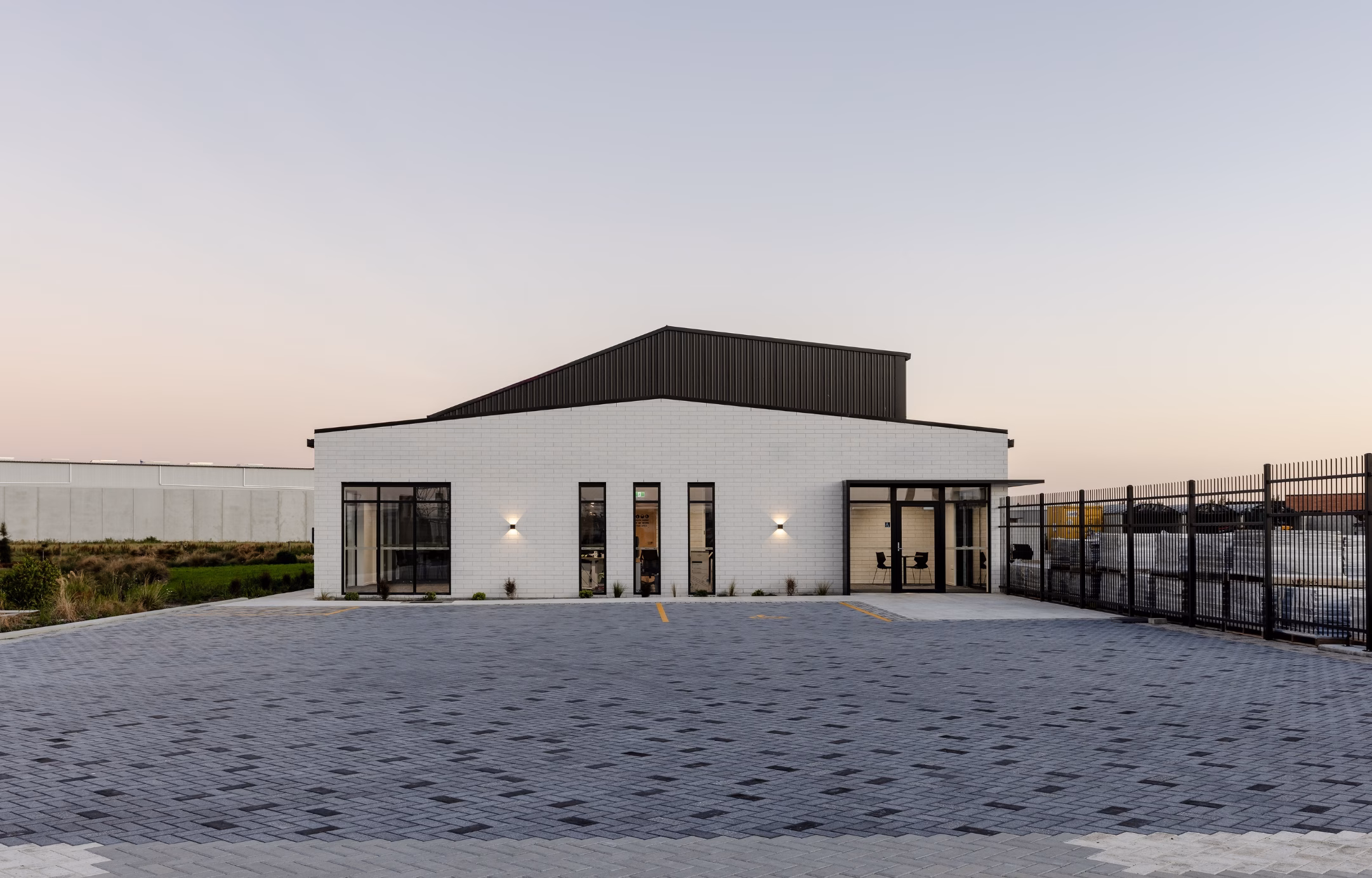
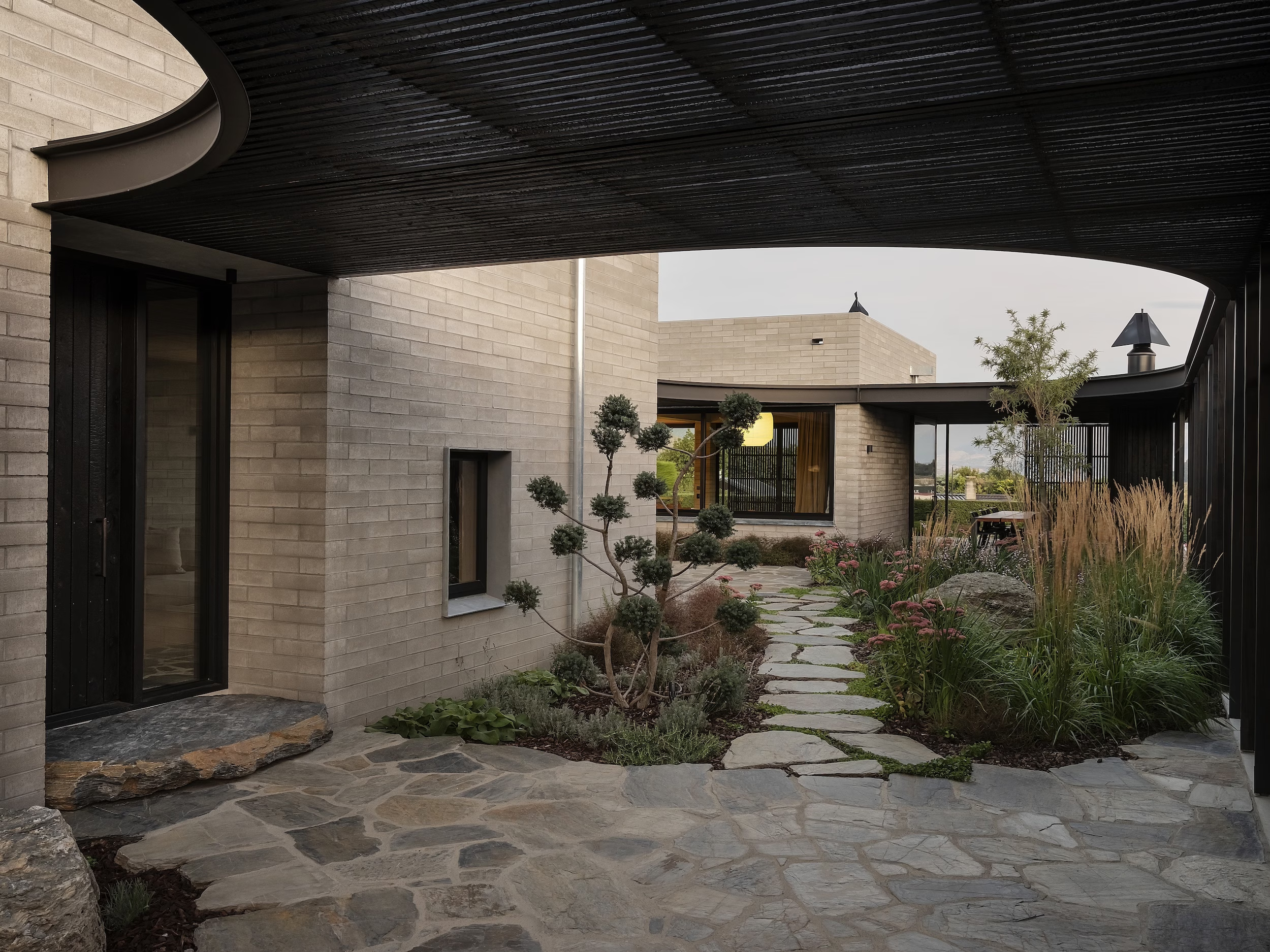
Viblock Showroom & Offices, Christchurch | Bricklaying by Advanced Brick and Block | Featured Products: 390 Half in White Quartz | Paving: London Pavers in a variation of Charcoal and Plain, Honed and Textured Treatments | Photography Hamish Storey
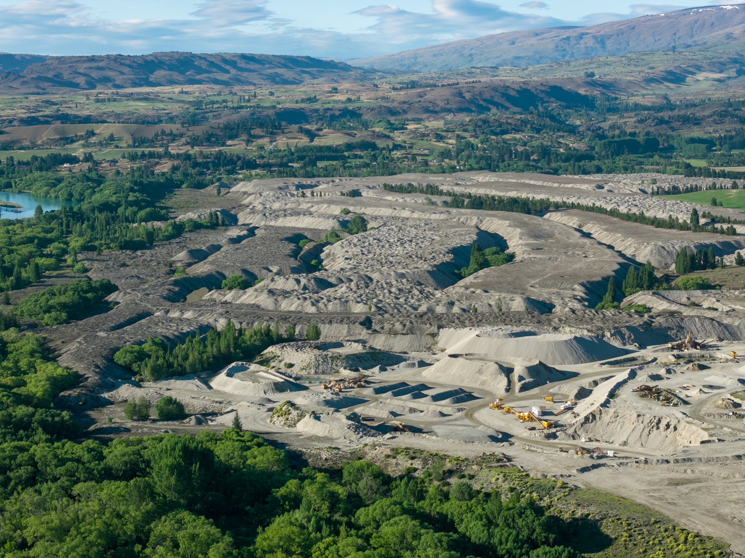
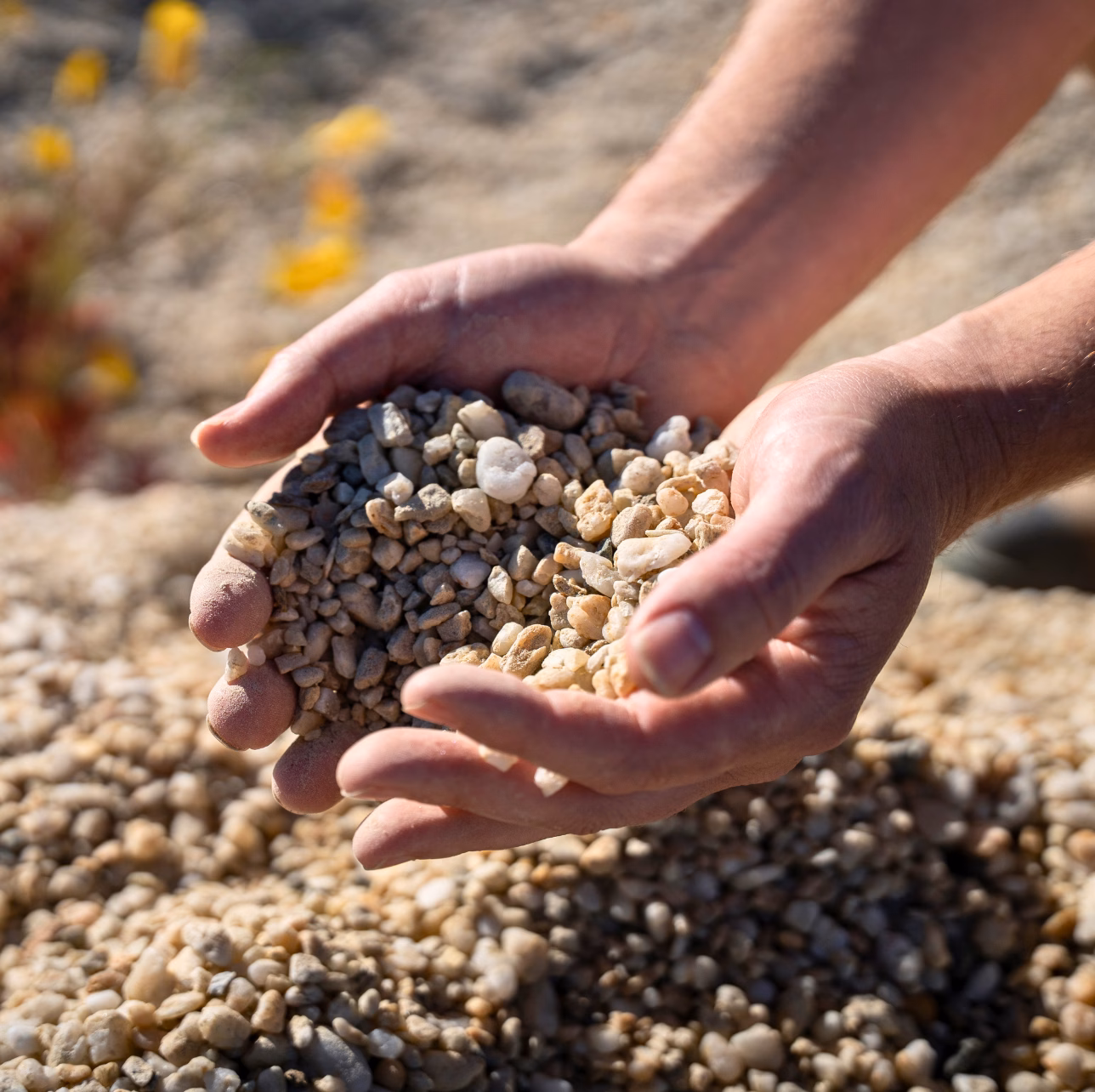
Viblock Alexandra Site | Photography Scrambler
Design-Led, But Built for Clarity
This rebrand isn’t just about a new logo or a polished catalogue. It’s a practical shift in how we communicate with our customers about the product experience. As our range has expanded, we’ve rethought how we name, organise, and present our products to better support the people who use them.
What’s changed? We’ve made it easier to compare options, understand where each product fits, and get inspired by what’s possible. The new system is:
- Intuitive to navigate
- Simple to specify
- Aligned with how designers and builders actually think and work
From texture-led design treatments to clearer product structures, every update is about removing friction and making space for creativity. You can spend less time decoding names and more time designing and specifying with confidence.
What’s Changing (And Why It Matters)
Here’s a quick overview of the five biggest changes you’ll notice — and why they matter for anyone working with Viblock.
1. Clearer Product Categories
We’ve grouped our entire range into three easy-to-understand categories:
- Structural
Load-bearing concrete blocks are used for walls, retaining walls, foundations, and structural systems. Think dimensional consistency, performance, and compliance. - Bricks
Aesthetic-facing units used across residential, commercial, and landscape projects. Whether honed, fluted, or split-face, these products are designed to be seen. - Landscaping
Dry-cast pavers, permeable surfaces, and other horizontal elements that define civic spaces, courtyards, and driveways.
Why it matters: You’ll instantly understand where each product fits. That makes it easier to compare sizes, textures, and applications with confidence.
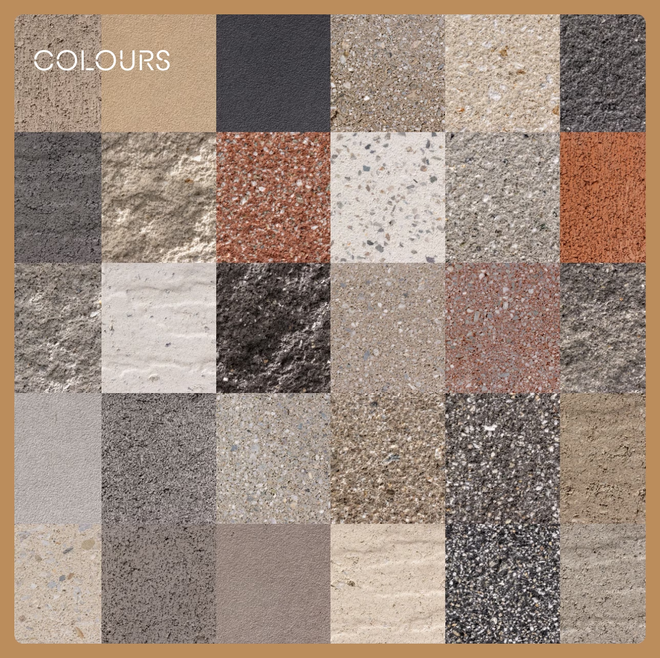
2. Simplified Colour Ranges
We’ve consolidated our colour offering into three clear tiers, designed to give you better clarity around aesthetics, availability, and application.
- Standard colours
These are oxide-based colours developed for everyday use. They’re deep, consistent, and generally available in stock, making them a great choice for projects where efficiency and cost certainty are key. - Premium colours
Crafted using naturally coloured aggregates sourced across the South Island — including Black Basalt, Cream Quartz, White Quartz, and Crawford Schist — these colours offer rich tonal variation and a strong connection to Aotearoa’s natural geology. Premium colours are typically made to order and may have longer lead times depending on volume. - Custom colours
For orders over 150m², we offer a fully customised colour service. Working directly with architects and designers, we fine-tune sand, aggregate, and oxide combinations to deliver one-off results that meet a specific brief. Mortar and sealer advice is also available to ensure cohesion across the final finish.
Why it matters:
You can now make colour decisions based on your project’s budget, design vision, and delivery needs. Whether you need something available now or you’re after something completely bespoke, our updated colour system gives you the clarity to plan with confidence.
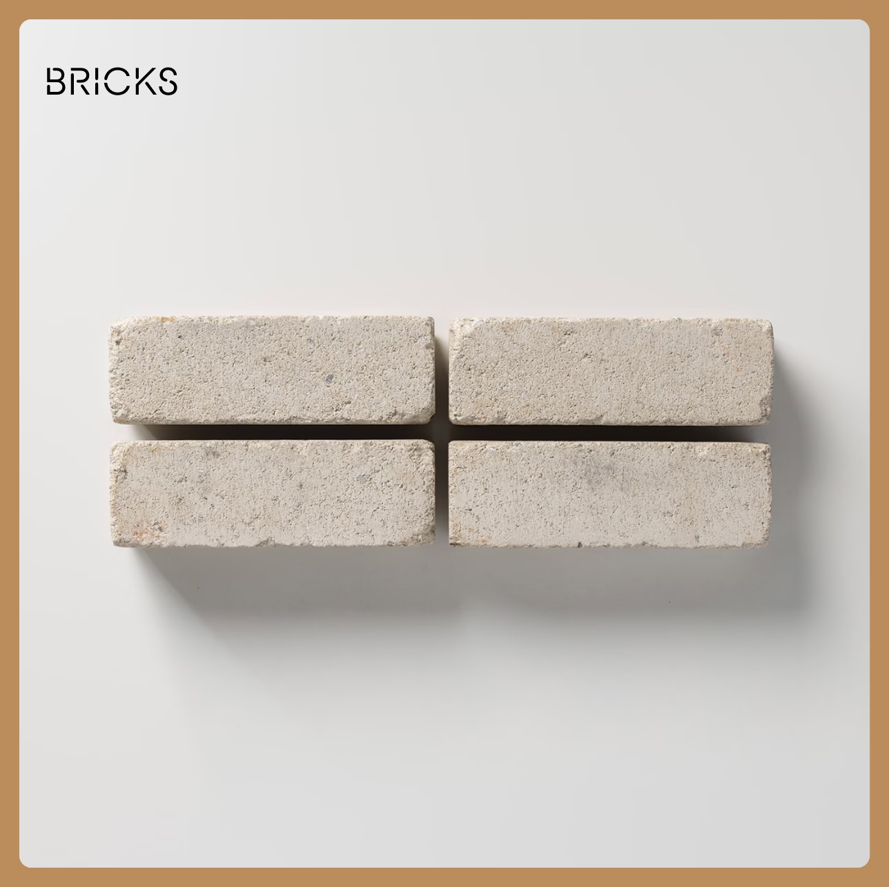
3. Straightforward Brick Naming
We’ve updated our brick naming system to make it easier to understand proportions, compare products, and select the right fit for your project.
Bricks are now named using their width in millimetres — for example, 220, 390, or 450 — followed by a descriptive term that reflects their shape or scale.
Here’s how it works:
- 220 Standard: A traditional brick shape with a 220mm width, ideal for residential projects or finer-grain design outcomes.
- 390 Half: A half-height version of our 390mm-wide brick, often used in architectural layouts that reference masonry proportions.
- 450 Slim: A long, slender brick with a 450mm width, used to create refined, linear visual effects.
We’ve also removed old sub-brands and legacy names to keep things consistent, intuitive, and easy to specify.
Why it matters:
Whether you’re matching an existing project or designing something completely new, the updated naming system gives you a clear sense of each brick’s scale and design intent — making it easier to compare options and select with confidence.
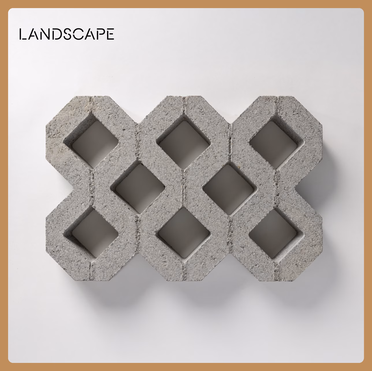
4. Easier Paving Selection
We’ve simplified the way our paving products are named and coded, making it easier to identify and specify the right format for your project — whether it’s a public plaza, a residential path, or a high-traffic driveway.
- In the dry cast range, paving units are now named by size, type, and colour. The codes are easier to read, and the naming now reflects the product’s dimensions and use, helping you select the right unit without needing to reference a spec sheet.
- For our wet cast range, we’ve aligned the stocked colours with our broader standard colour offering. This brings more consistency across product types, while still allowing for special orders on large or bespoke projects.
Why it matters:
Simpler names and clearer codes mean less time spent decoding specifications. You’ll be able to plan and order with greater confidence, knowing exactly what you’re getting — and how it fits with the rest of your material palette.
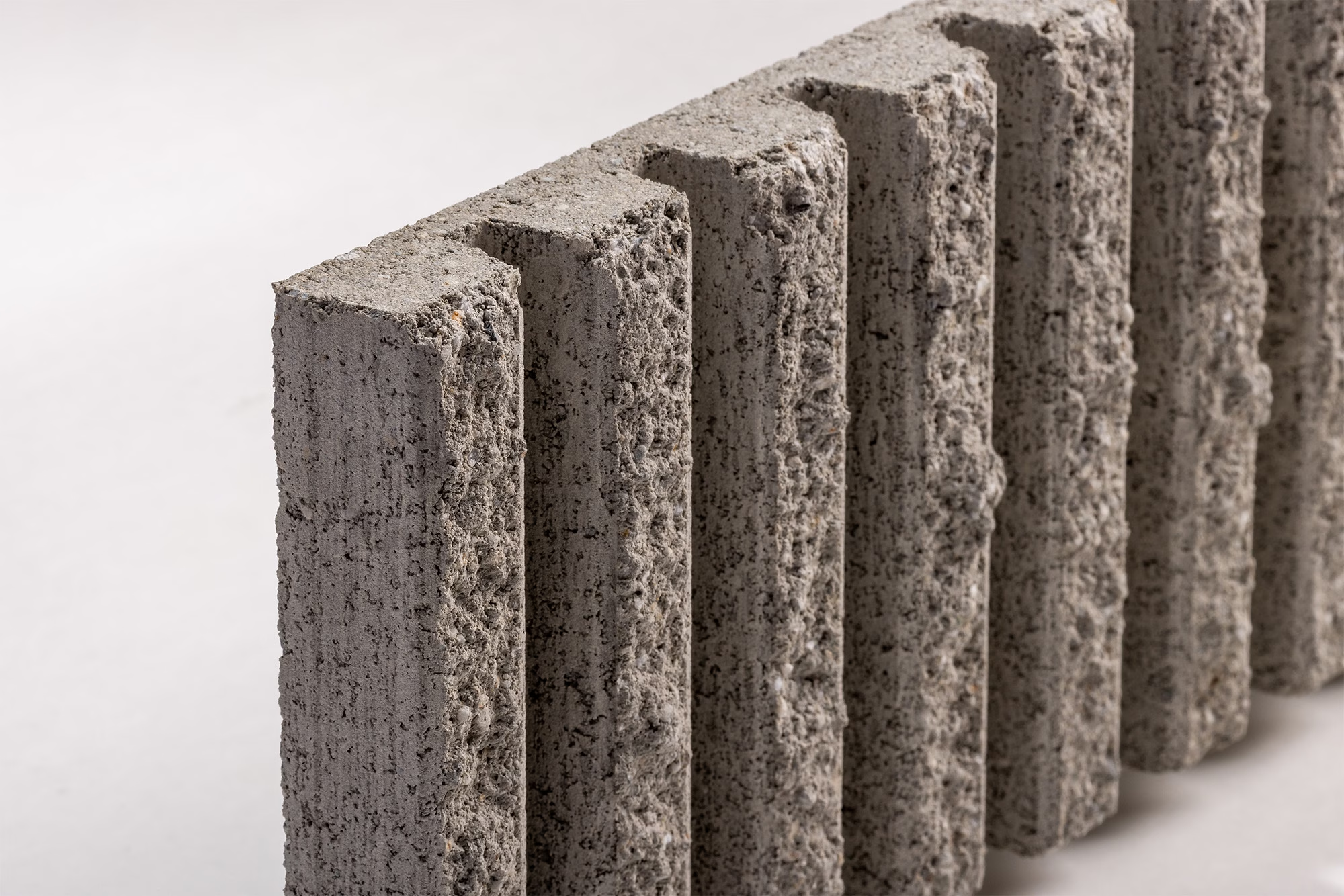
5. Textures Made Simple
Surface treatments play a huge role in how a wall feels, catches the light, or weathers over time. That’s why we’ve made it easier to understand and select from our full range of textures.
Treatments like fluted, honed, split-face, textured, and rumbled are now consistently named and described across our product catalogue, website, and specification tools. Each one has a clear definition, with imagery to show how it looks in context.
This clarity means you can now choose finishes based not just on aesthetics, but on how they interact with light, shadow, and the surrounding materials in your design.
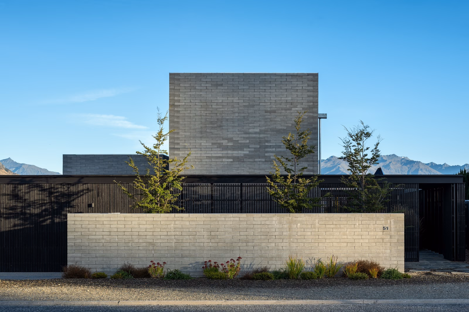
Project by Roberts Gray Architects | Featured Products Structural 20 Series and 390 Half Grey | Photography Simon Devitt
What This Means for You
At the end of the day, this rebrand is about making things easier for you. All without compromising the things that matter most.
Whether you’re an architect, builder, developer, or homeowner, here’s what you can expect from the new Viblock system:hea
More intuitive selection
You’ll spend less time trying to decode codes, match sizes, or understand texture names, and more time focusing on design intent. Our new product structure removes confusion and empowers decision-making.
Smarter design support
With clearer colour categories, consistent treatment options, and easier-to-understand naming conventions, you can quickly build palettes, match materials, and communicate your vision to stakeholders.
No change to what we’re made of
This isn’t a change to our values or how we manufacture. It’s a clearer and more considered way of presenting what we do, so you can engage with our products more easily and with greater confidence.
You can still count on:
- Locally sourced aggregates from Central Otago
- Low carbon concrete with upcycled inputs
- Products that are consistently independently tested to exceed NZ building standards
- Personal, hands-on service from a team that genuinely cares
Craft. Precision. Care. These are the principles that guide every product we make and every project we support.
Want More Detail?
If you’d like to explore the full range of colours, finishes, sizes, and customisation options, our Viblock Product Magazine is now available.
It includes:
- The complete 2026 product range
- Colour charts and treatment examples
- Brick and block sizing tables
- Design inspiration and project features
You can also explore the full product library and design tools below. And if you’re not quite sure where to start, our team is always here to help with guidance, samples, or technical support.
Let’s Build Something Together
This brand refresh and new product naming system is about clarity, simplicity, and ambition. It’s designed to help you create buildings, homes, and spaces that reflect the best of New Zealand’s built environment, while making the process smoother, smarter, and more collaborative.
Whether you’re returning to Viblock or discovering us for the first time, welcome. We’re here to help you unlock your architectural ambition.
Project by Roberts Gray Architects | Featured Products Structural 20 Series and 390 Half Grey | Photography Samuel Harnett