When most people choose concrete bricks or blocks, they’re thinking about structure, durability, and cost. What they often underestimate is how much influence they have over what the finished wall actually looks like — and how it will continue to look ten, twenty, or thirty years from now.
Treatments and colours are where that influence lives. They’re what turn concrete from a standard building product into a deliberate design decision. And understanding how they work — together, and in relation to light, context, and installation — is what separates a wall that simply exists from one that does real architectural work well.
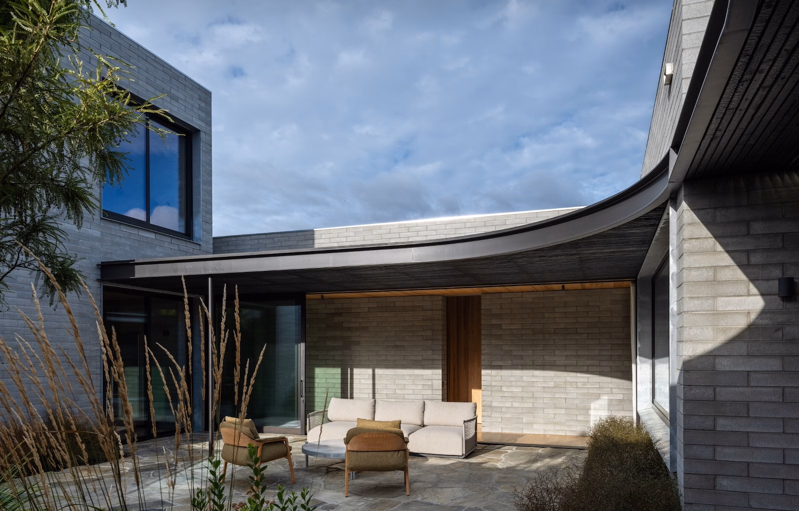
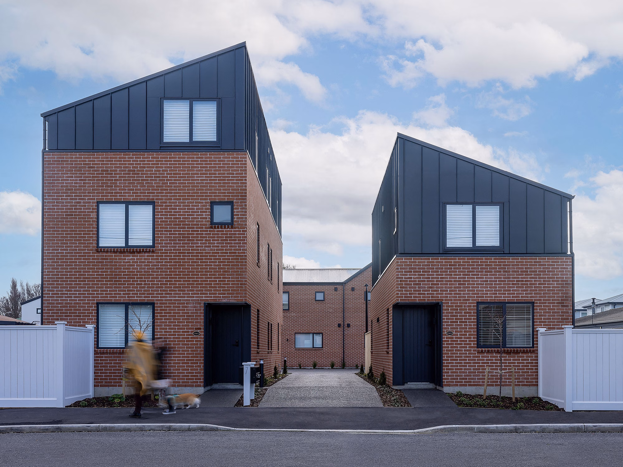
Project by Roberts Gray Architects | Featured Products Structural 20 Series and 390 Half Grey | Photography Simon Devitt
1) What do we mean by “treatments”?
A treatment is the finish applied to the face of a concrete brick or block. It doesn’t change the structural performance of the product. What it changes is the visual character of the wall — how the surface reads up close, how it reads from a distance, and how it behaves in different light conditions.
Viblock offers six treatments across it’s range:
- Fluted creates a uniform linear profile that generates consistent shadow lines across the wall. It’s one of the most architecturally expressive options and works particularly well in contemporary builds where rhythm and repetition are part of the design language.
- Honed is achieved through a polishing process that exposes the aggregate. The result is smooth, refined, and well-suited to interior applications where a more considered, high-end feel is needed.
- Textured roughens the surface to expose aggregate in a natural, non-uniform way. It has tactility and authenticity, and works well where a more organic, material-led response is appropriate.
- Split face uses a splitting process to create a bold, irregular surface inspired by the natural look of stone. Unlike fluted, the shadow it casts is non-regular — it shifts throughout the day and across seasons, giving the wall an ever-changing quality.
- Plain Plain is the product as it comes from the machine. Clean, simple, and the most affordable option. It’s not without design value — in the right context, restraint is exactly the right call.
- Rumbled removes the clean edges of the brick or block to create a weathered, lived-in appearance from day one. It suits rustic or heritage-influenced architectural responses and pairs well with warm, earthy colour choices.
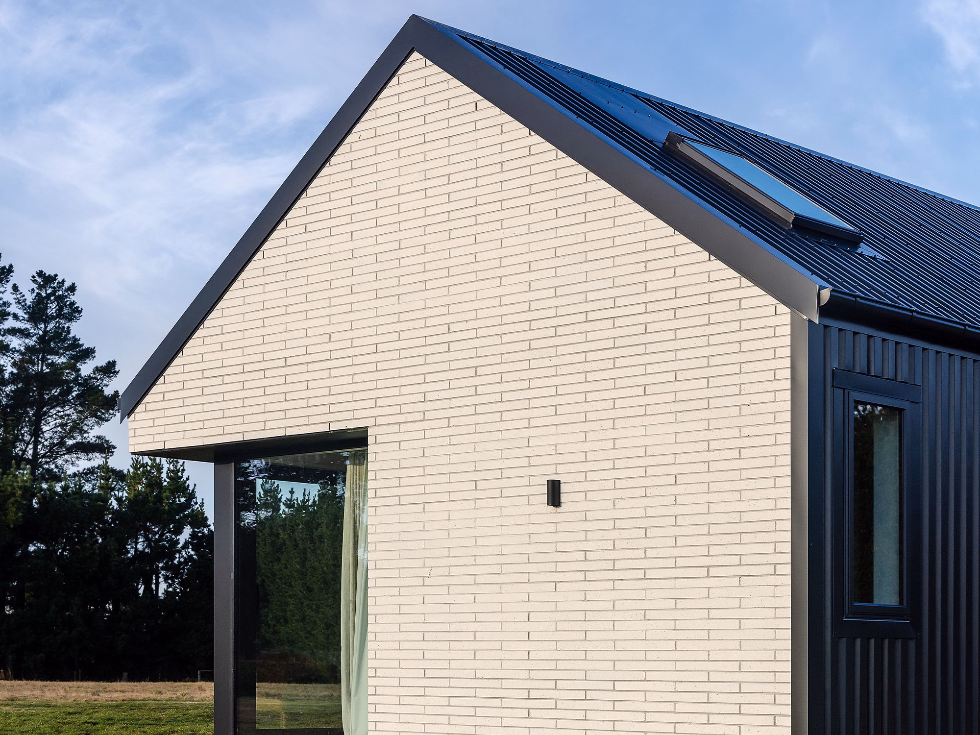
Featured Products 450 Slim White | Photography Hamish Storey
2) Why colour in concrete is different
Choosing a colour for concrete is not the same as choosing a paint colour. Concrete colour is derived from the materials that make up the product — the aggregate, the sand, and in some cases, the oxides added to the mix. The result is a colour with inherent depth and variation that behaves differently from a flat applied finish.
Viblock’s premium colour range — Black Basalt, Crawford Schist, Cream Quartz, and White Quartz — takes this further. Each colour is named after its source aggregate, drawn from across the South Island, and the tonal variation in the finished product reflects the natural geology of those materials. The colour isn’t applied to the concrete. It comes from within it.
The standard range uses high-quality oxides to achieve colours including Carbon Black, Charcoal, Grey, Tan, and Terracotta. These colours will naturally patina over time — developing character rather than simply fading.
What this means practically is that two bricks of the same colour will not look identical, and that’s not a flaw. A subtle tonal difference is part of what gives a concrete wall warmth and life. It’s worth understanding this before you expect the uniformity of a painted surface — and worth appreciating once you do.
For how natural variation adds richness without fuss, read: Concrete Brick Beauty: How Natural Variation Helps Create Timeless Walls
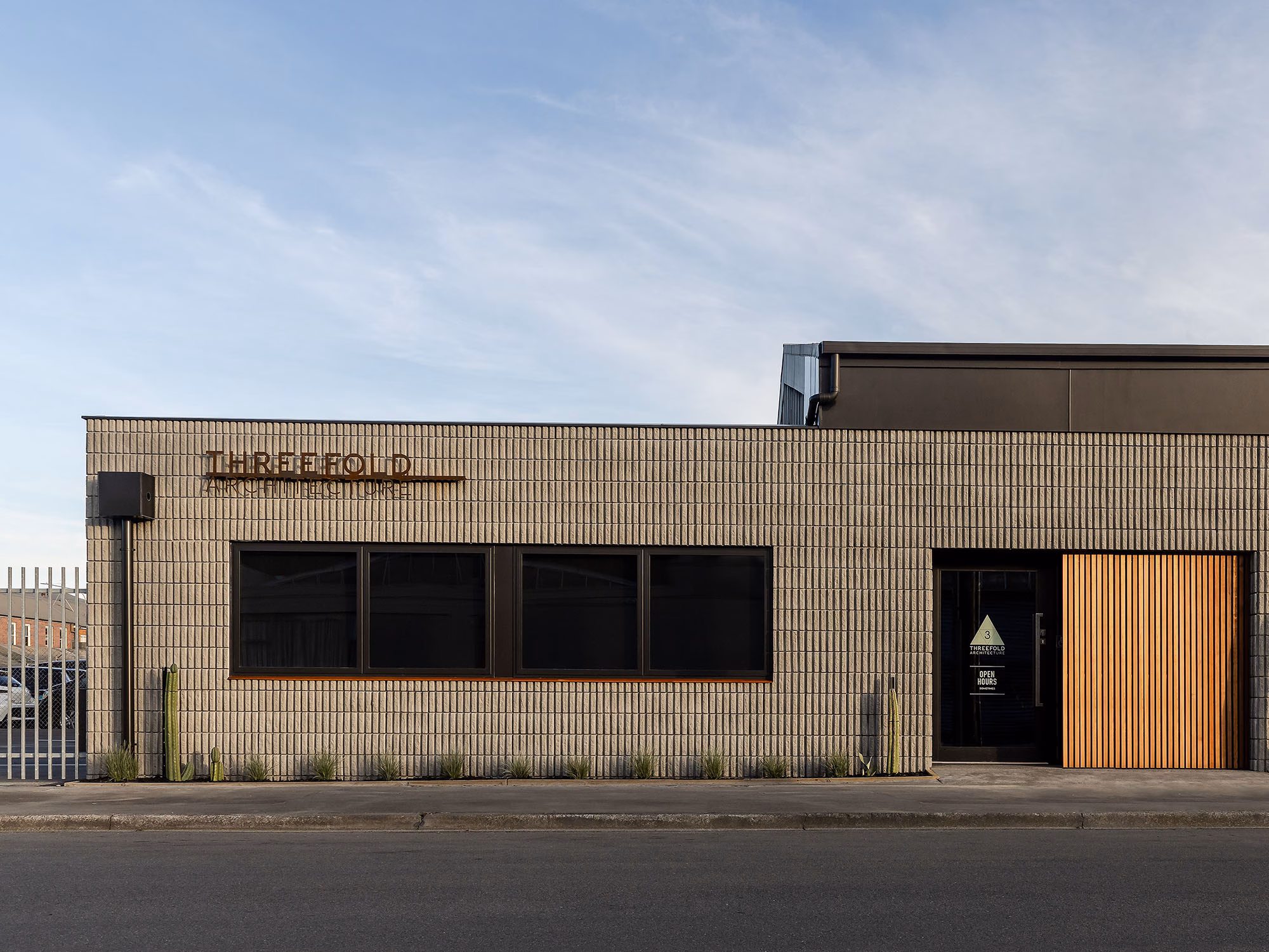
Project by Threefold Architects | Featured Products 390 Fluted Grey | Photography Hamish Storey
3) How treatment, colour and light work together
This is where the decision becomes genuinely interesting, and where many people don’t think deeply enough.
A treatment doesn’t just change how a surface looks in a product photo. It changes how that surface behaves across the course of a day, in different weather, and across different seasons.
Fluted concrete casts a consistent, linear shadow. In morning light, those lines run in one direction. By afternoon, they’ve shifted. The wall reads differently depending on when you look at it and where the sun is sitting — but the rhythm stays controlled and precise.
Split face works differently. Its irregular surface creates a non-uniform shadow that shifts more subtly and unpredictably. Where fluted gives you architectural structure, split face gives you something closer to the natural variation of stone.
Honed surfaces interact with light in a different way again. The exposed aggregate catches and reflects light evenly, giving the wall a calm, refined quality. In interior settings — feature walls, bathrooms, living spaces — this can feel genuinely considered rather than simply hard.
Textured finishes emphasise the depth of the material itself. They absorb light rather than reflect it, which tends to make them feel grounded and tactile rather than sharp or graphic.
When you layer colour on top of treatment, the effect compounds. A Crawford Schist in a fluted profile will read very differently from a Crawford Schist in a rumbled finish — even though the base colour is the same. Treatment determines how the colour is presented to the eye.
If you like a soft coastal aesthetic, see Inside Alex & Corban’s Timeless Coastal Retreat – Featuring Viblock’s New Brick Slips for how light tones and true-colour materials achieve that look while keeping long-term durability.
For installation and weathertight guidance, your designer or builder can refer to the Brick Veneer Best Practice Guide from Master Brick & Block NZ, which aligns with the approach Viblock recommends.
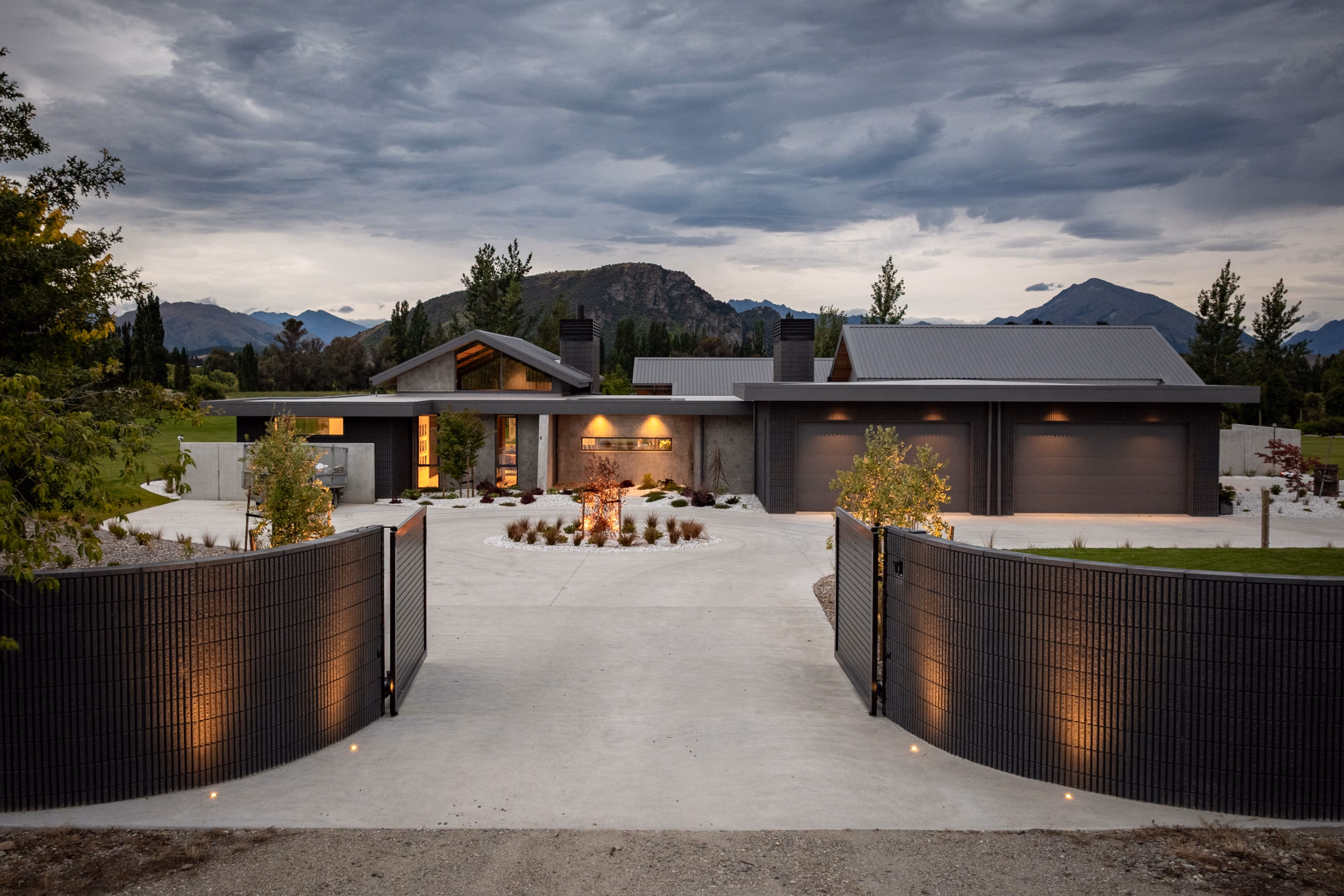
Project by Reign Architecture | Build by Bespoke Builds | Installer Masonry Worx | Featured Products: 20 Series Fluted Structural and 390 Fluted Brick in Carbon Black | Photography Simon Larkin
4) Red Stag Rise: one treatment language across a whole project
One of the clearest recent examples of treatment working at a project-wide scale is Red Stag Rise in Wānaka, designed by Reign Architecture and built by Bespoke Builds with brick and block insallation by Masonry Worx — a home that will be featured in full in next month’s issue of Abode magazine.
At Red Stag Rise, fluted concrete runs as a consistent thread throughout the project. Viblock’s 20 series fluted blocks were used on the entrance gate, and 390 fluted bricks were used across the exterior walls and internal feature walls. It’s a deliberate decision — the same treatment language carries from the first point of arrival through to the interior spaces, creating a sense of architectural continuity that feels intentional rather than coincidental.
The fluted profile does specific work at this scale. It adds texture and shadow to raw concrete surfaces without introducing complexity. It’s a precise, repeatable detail that, when used consistently, becomes part of the identity of the home rather than just a surface finish on one wall.
It also demonstrates something worth noting for anyone in an early design conversation: a single, well-chosen treatment used with consistency across a project will almost always produce a stronger result than several treatments used in combination.
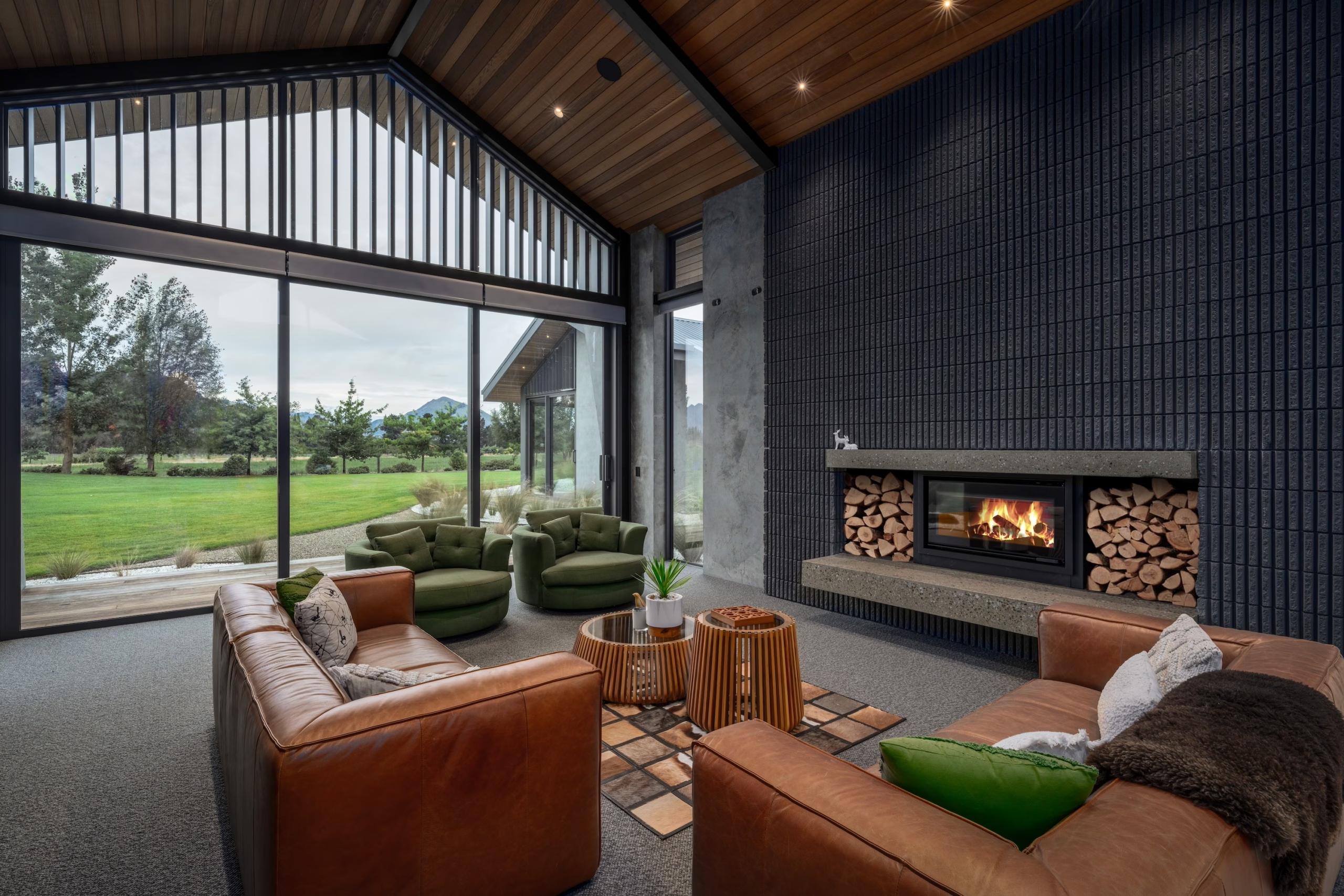
Project by Reign Architecture | Build by Bespoke Builds | Installer Masonry Worx | Featured Products: 390 Fluted Brick in Carbon Black | Photography Simon Larkin
5) Choosing the right treatment for your project
There’s no universal answer, but there are useful starting points.
If you’re working on a contemporary build and want a clean architectural rhythm, fluted is the most considered choice. If you need a refined interior application — a feature wall, a bathroom surround, a fireplace — honed offers the right level of finish. If you want a surface with natural variation and tactility that feels connected to its landscape, a textured or split face will serve you better than something more engineered.
If the project has a heritage or rustic character, rumbled is the most honest response. And if budget is the primary constraint without wanting to sacrifice quality, plain delivers the product at its most straightforward — and in the right setting, that’s entirely appropriate.
6) Mortar and installation matter more than most people realise
The treatment and colour on the brick or block face are only part of the final result. Mortar colour has a significant effect on how the overall wall reads — a pale mortar against a dark brick will emphasise the joint lines, while a closer match will let the surface texture do the work. Getting the mortar selection right is not an afterthought.
The installation technique also matters. Consistent joint width, clean work, and careful handling of textured or split face products all affect the finished appearance in ways that can’t be corrected once the wall is up. Viblock provides installation guidance precisely because these decisions interact with product performance and visual outcome.
Featured Products 220 Standard Terracotta with White Mortar | Photography Hamish Storey
7) Why these choices are easiest to make early
Treatments, colours, and mortar selections are the kind of decisions that feel low-priority early in a project — and become high-stakes once the structure is up. The finish of a wall determines whether a home feels quiet or bold, warm or austere, grounded or graphic. Getting that right requires making the decision with enough time to properly consider it, rather than defaulting to whatever is quickest to specify.
For homeowners especially, the value of understanding this early is that it keeps options open. A conversation with your architect or builder about treatment and colour at the concept stage costs nothing. Changing your mind once the product is on site costs considerably more.
For ideas on how different bonds and finishes can lift a project, see: 7 Creative Ways to Transform Brickwork Into Architectural Design Statements
Concrete is not one look
That’s the point worth taking away from all of this. With the right treatment and colour, concrete can feel sharp and architectural, calm and refined, or textured and deeply grounded in its landscape. The material has a range — more than most people assume when they first consider it.
Red Stag Rise is a strong example of what happens when those decisions are made with clarity and followed through with consistency. One treatment, carried from the entry gate to the interior wall, becomes part of what the home is — not just how it’s finished.
The decisions are there to be made. Making them well and making them early is what gives concrete its full potential as a design-led material.
Explore Viblock’s full range of treatments and colours on our website.
Talk with our team about how Viblock can help align your design vision and budget. We’re here to support you with clear, practical information so you can make informed choices and approach your project with confidence. Reach us by calling 0800 842 562.